Photography Website Template
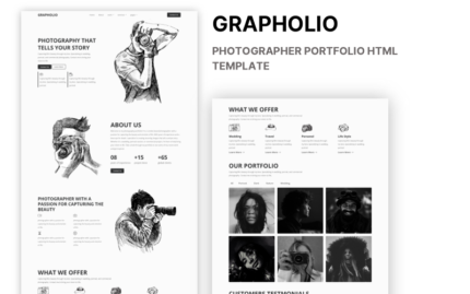
This template is made for people who are in the field of photography. It is stunning for freelance photographers or anyone who wants to show their gallery to the world!
To create it our developers used HTML, CSS3 and Bootstrap and JS frameworks. The template is responsive, which means that it has flexible design. It can change according to the screen size of the device, therefore looks perfect as on PCs and laptops, as well on smartphones or tablets.
Our designers considered every single detail to make the first impression of this website simply amazing!
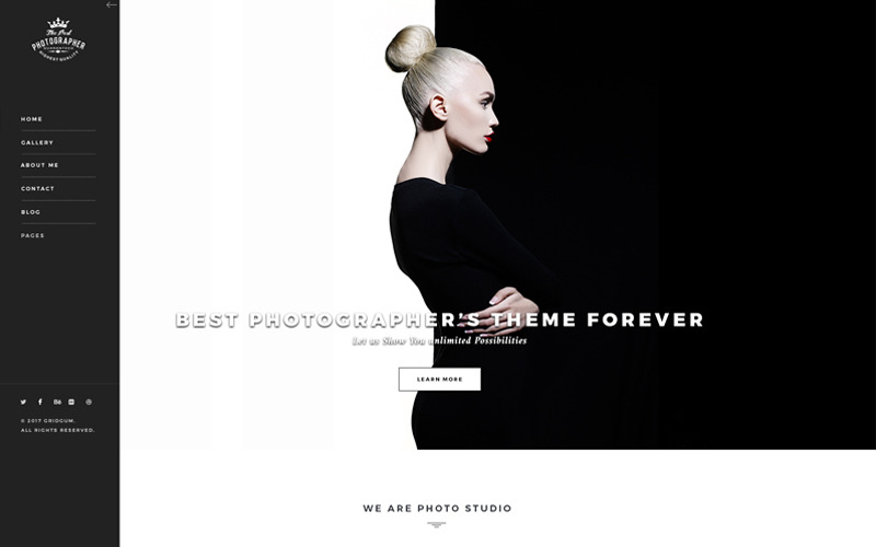
As you can probably already see, the main menu is placed on the left side column of our Home page. It is closed on default, but you can view it by clicking on the button on the top.
To make the impression better, we decided that menu should stay perfectly still while scrolling through other pages. You can see that there are pages for Home, Gallery, About me, Contact, Blog and Pages.
We would like to begin from the most important one, which is Gallery Page. When you move around your mouse in gallery section, you can see the animated sub-menu, with as many of the sub-menu categories as you wish.
Now you can see following galleries:
- Full style 2 columns wide
- Full style 3 columns wide
- Full style 4 columns wide
- Full style 2 columns wide with photo information
- Full style 3 columns wide with photo information
- Full style 4 columns wide with photo information
- Masonry 2 columns wide
- Masonry 3 columns wide
- Masonry 4 columns wide
- Masonry 2 columns wide with photo information
- Masonry 3 columns wide with photo information
- Masonry 4 columns wide with photo information
We would like to tell you more about the functionality of the webpage. When clicking a certain photo, the page is switch to what is called a “demonstration page”. You can view each photo on full screen.
This page has 3 important buttons. If you press either or icons, you have the ability to view each photo in the album or the category. If you click on the arrow that is shown in the top, you have the ability to go back to the gallery category page, however, if you click on the “i” button, you will see a detailed description, where you can add more/related information.
You can also view the same information, if you click read more button.
We made sure to include all details that is needed for as starter or as well for professional photographers. You will also have the ability to customize this template, if you think that any changes are necessary, with any HTML editor.
We are going to make new pages for the template and expand its functionality. These additions might include adding a purchase page/checkout page with PayPal button. Anyone who has bought the template will be fully informed when the update comes out and of course, you will have the ability to download it for free.
Main Features
- Fully Responsive
- Built in Bootstrap
- Amazing CSS3 Effects/Animations
- Optimized Code
- Simple & Easy to Use/Customize
- Working Contact Form
- Google Map
- Font Awesome icons
- Clean Design
- 12 Photo Galleries
- Documentation
- Support
Credit
- Html5shiv
- Respond
Google Web Fonts
- Amiri
- Crimson
- Monserrat
Images are used for promotional purposes only and are not included into the pack.

